Is She a Winter or a Summer? The Long Fashion Legacy of Color Me Beautiful
In Depth
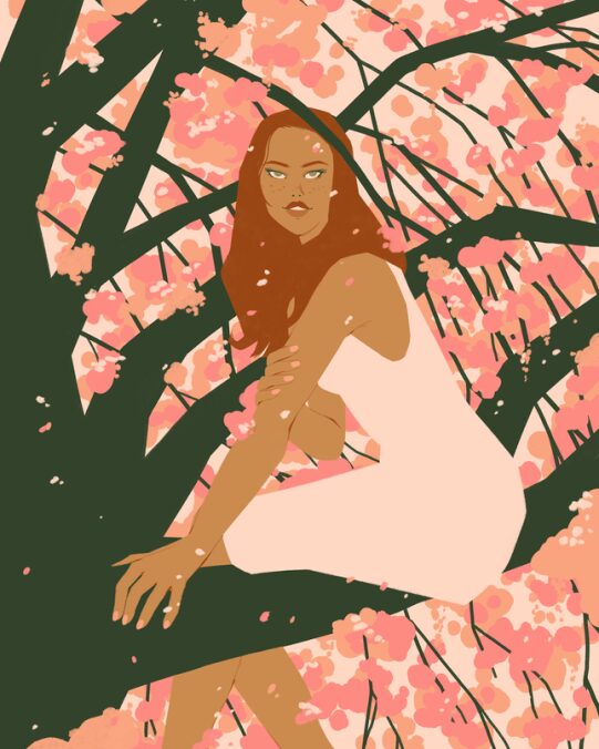
Illustration: Chelsea Beck
When Carole Jackson was a girl, she wanted “so much to be pretty,” but her reflection in the mirror—especially when she was wearing her school uniform—always let her down.
“While the powder blue uniform required at my school made some of the girls look great, it did nothing for me. It in fact made me look gray, dull, and lifeless. The color of that daily uniform robbed me of some potentially good feelings about myself well into adult life,” Jackson later wrote. It wasn’t until she finally discovered her colors, thanks to an image consultant, that she finally found “the missing link to finding [her] best self.” With the zeal of the converted, she optimized her own system, which became the style and self-help manual Color Me Beautiful.
Published in 1980, Color Me Beautiful became the foundational text of image consulting, with its mixture of how-tos and sheer conviction in color-powered magic. It sorted people (well, women first, and largely white women at that) into four big categories: Spring, Summer, Autumn, and Winter. It had nothing to do with their birthday, but instead depended on the temperature (cool—warm) and the value (light—deep) of their skin tone, hair color, and eye color. Spring was warm and light; Summer was cool and light; Autumn was warm and deep, Winter was warm and deep. You could determine it by draping yourself in different colors. The right ones would make you look healthy and, yes, younger. The wrong ones would make you look sickly and do weird things with your under-eye area and jawline. The method struck a perfect balance between esoteric and logical, and the guide remained a New York Times bestseller from 1980 to 1995, selling 13 million copies and even spawning a men’s version (1985’s Color for Men), an empire of fabric-swatch packets to carry with you while going shopping (lest you stray from your colors!), a cosmetics line, and, of course, an army of color consultants. After a lull in the late 1990s and the early 2000s, Pinterest and Instagram have revived the method, turning it into an aspirational pastime fit for the social media era—we all know, and see, how well cogent color schemes work on any feed.
But what good is knowing one’s own “Season” anyway?
“For just as nature has divided herself into four distinct seasons, Autumn, Spring, Winter, and Summer, each with its unique and harmonious colors, your genes have given you a type of coloring that is most complimented by [its own] seasonal palette,” Jackson declared in the introduction. “Color is magic and now let it work for you!” Ok then!
This proclamation, which sounds like a hybrid between astrology, medieval humor theory, and a particularly enthusiastic discussion of auras, is the foundation of one of the most timeless fashion and styling tips of the 20th century, namely Seasonal Color Analysis. It’s been 40 years since Color Me Beautiful first saw the light, quickly reaching the status of 1980s cultural sensation. But far from a curious cultural relic consigned to antique malls, the method is more popular than ever, attracting a global fanbase in the context of the color-coded aesthetics of Instagram and Pinterest and amid a reaction to fast fashion.
Seasonal Color Analysis is a palette-picking practice commodified in the 1980s, but the underlying concepts are decades older, rooted in theories developed in the 1920s by the Swiss painter and Bauhaus instructor Johannes Itten namely, that colors may be warm or cool; bright or soft; light or deep, and their combinations more or less complementary.
Around 1928, Itten began observing that, whenever he assigned his students to paint a “harmonic color combination,” each student, with their own prior knowledge of art and art history, had their own interpretation of what constituted “harmony.” That said, they tended to fall into patterns. He referred to this phenomenon as “subjective color,” which overlapped with “the area of a person.”
“Light blond types with blue eyes and pink skin incline towards very pure colors, often with a great many distinguished color qualities […] A very different type is represented by people with black hair, dark skin, and dark eyes, for whom black plays an important part in the harmony,” he wrote in the art-theory book The Elements of Color, first published in German in 1961 and then translated into English in 1970. He went on to associate subjective colors to a particular season (Spring, Summer, Autumn, Winter), which then became the foundation of personal, or seasonal, color analysis. His conclusion was that, beyond the personal or subjective color preferences, what we intend as “harmony” is, to some degree, objective. “Though I have diligently sought opinions on my color representations of the seasons, I have never yet found anyone who failed to identify each or any season correctly,” he said. “This convinces me that above individual taste, there is a higher judgment in man which, once appealed to, sustains what has general validity and overrules mere sentimental prejudice.”
In particular, Spring has warm and bright colors; Summer has cool and muted hues; Autumn has a warm and muted palette, while Winter has a cool and bright one. The naming is less haphazard as it seems: much like the white balance of a photo camera, it refers to the way the sun rays and sunlight in general reflect on surfaces across the seasons, the way light itself interacts with atmospheric phenomena, and to the type of flora and foliage that characterizes each season: Spring has yellow daffodils; Summer has soft-colored hydrangeas; Autumn has foliage; Winter has stark and dramatic high-contrast snowscapes.
Old Hollywood was using these principles even before they were formally “coded” by Itten as seasons. As Scarlett O’Hara in Gone With the Wind, Vivian Leigh consistently wore the jewel tones typical of the Winter palette (except for when she was in dire straits); Grace Kelly played Frances Stevens in To Catch a Thief in powdery pastels typical of the Summer palette. We can also see it among Disney Princesses: Snow White’s high contrast coloring (her pale skin and dark hair) and her brightly-colored outfit marks her as a Winter; Cinderella, with her blond hair, rosy complexion, blue eyes, and ice-colored gown, looks like what we would define as a Summer, while Aurora, who is a blonde like Cinderella but has a warmer complexion and wears gold jewelry with her bright blue (or pink) dress, is a Spring.

But it was 1980 when these theories of color went truly mainstream. Suzanne Caygill, a Renaissance woman and proto-lifestyle guru best known for working with Edith Head and for her CBS show “Living with Suzanne,” a show centered on self-improvement, published Color: The Essence of You. Carole Jackson published Color Me Beautiful the same year. The latter, in particular, became a real pop-culture phenomenon that spanned a retail empire selling swatch packets containing samples of fabrics to aid in shopping, a line of cosmetics and, of course, an army of trained color consultants, turning Color Me Beautiful into a Multi-Level-Marketing operation.
The tone of these books was inspired, yet prissy and stern. Caygill advocates for harmony: “Just as the foliage of each plant is designed to give significance to each flower, so should the ornamentation of clothing, jewelry, furs, textures and even the woods in your home furnishings, enhance your native pigmentation and give significance to you as an individual.” Jackson is far less lofty. Are you a cool-toned Summer and love marigold? That’s your problem, darling. “There are two important reasons for not mixing palettes or ‘borrowing’ colors from a palette that is not yours. First, you will look best in your own. Why look good when it’s just as easy to look great?” she writes. “Second, each palette has been carefully arranged to give you a well-coordinated wardrobe, consisting of compatible tones. If you buy colors helter-skelter, you will end up with a closetful of clothes and nothing to wear.”
Color analysis served the 1980s market well. “Clothing was expensive, and you wanted to buy it right. It had to do with making sure you understood how your clothing went together, so that when you were adding pieces to your wardrobe, it unlocked lots of potential new outfits,” explained journalist and author Elizabeth Cline, whose books include Overdressed (2012) and The Conscious Closet (2019). “Color theory appealed to people on a budget because it was about extending the life of clothing that you already owned and ensuring that whatever you bought, you could get a lot of use out of.” What’s more, Jackson’s business model worked in a way that, if you invested in a Color Me Beautiful certification, you could then start your own activity as a color consultant yourself. At least on paper, it was an ideal way to supplement one’s income.
But the Color Me Beautiful method’s success backfired, to a degree—by the 1990s, it was a punchline, considered a phenomenon relegated to middle America, small towns, and a conservative approach to fashion. Michael Moore has a segment on it in his 1989 documentary Roger and Me, an exploration of the Flint area following the closing of the local plant of General Motors: after a color consultant conducts a demo, the montage cuts to a few months after the presentation. “She phoned me in a panic and asked that we please come back, as she had made a terrible mistake,” he narrates. She found out she was a “Spring” instead of an “Autumn.” “It really shocked me,” she told Moore.
In the March 20, 1996 installment of Bridget Jones’s Diary, Bridget Jones’s overbearing, but well-meaning mother thwarts her daughter’s plan for mother’s day in an attempt to prettify her. “I’m taking you to have your colours done,” she tells her. When Bridget appears confused, she elaborates further: “Yes, darling, Colour me Beautiful. I’m sick of you wandering round in all these dingy slurries and fogs. You look like something out of Chairman Mao.”
And, too, Color Me Beautiful was written for an assumed audience of white women, and to the extent it even attempted to include others, the book applied blanket-season-definition on ethnic groups, such as “Blacks, Italians, and Jews are Winters,” heard in Roger and Me, and that “Olive-skinned people and most blacks and Orientals look radiant in clear, vivid, cool colors, but sallow in warm colors,” making it racist; truth is, each skin tone, from the fairest to the deepest, can be any of the four seasons, as what matters is the contrast (or lack thereof) between skin-tone, hair color, eye color, the sclera, and so forth. If Lupita Nyong’o is indeed a Winter, Beyoncé is more of an Autumn, while Rihanna, depending on whom you ask, is either an Autumn or a Spring. Future iterations of Color Me Beautiful subdivided each season into sub-groups, using three parameters (light-deep; bright-soft; cool-warm), which served the existing wide range of skin tones much better.

However, in the last decade and with a boost from Instagram and other visually-oriented social media, where an emphasis on a harmonious color palette and an obsession with a consistent “aesthetic” on one’s feed plays a key role, and where more recent short-video features such as “stories” and “reels” lend themselves to short videos with a strong visual component to get their message across, seasonal color analysis has achieved global popularity in countries including Brazil, Korea, Japan, and Italy and with a stronghold in the United Kingdom, tailoring their methods to their local audiences.
In Brazil, for instance, high-end women’s magazines such as Vogue and Marie Claire have extensively covered what is known there as colorimetria or coloraçao pessoal. Local celebrity stylists Manu Carvalho and Roberta Freitas are among the biggest promoters of the method, and the hashtag #coloraçaopessoal has over 65,000 hits. The local initiative Bela Cancer uses color analysis to help cancer patients and their self-esteem during treatment.
Korea’s makeup giant, Etude, has been hosting a “Color Factory” in its flagship store for lengthy pop-ups since 2017. Emma Bassett, a British ex-pat based in Japan, recalls that after completing a color analysis with drapes at the “Color Factory,” customers could choose two shades from a range of colors and then the consultant would pick two in turn. “Originally I’d chosen a bright pink and a nude pink, typical of what I often buy,” she said over Instagram DM. Yet, as a “cool summer,” she was misguided. “The consultant picked an orangey-red color and a purple color, something that I thought would never in a million years suit me, but it was a really sheer lipstick and it looked perfect on. Too many times I’ve bought lipsticks because I think the pink color looks bright and summery and then when I get it home and try it, it looks horrendous, almost like I’m a child playing dress-up.”
“Korea is definitely a trends-driven place where everyone wants to be the same,” said Tina Cho, who wrote about the phenomenon when working at Soko Glam. “It’s a little bit difficult to stick out, but at the same time, the times are changing, and people want things that are special and individualized; the focus is shifting more to the individual rather than to the collective experience.”
The same is true of Italy where, since late 2018, the term Armocromia, a wordplay on the Italian words for “Harmony” and “Chrome” has entered the everyday vocabulary thanks to Italy’s leading image consultant and now bestselling author Rossella Migliaccio, who has made Italian influencers of all sizes and the general Twitter population rhapsodize on what season they belong to. Italy, she maintains, especially in the age of Instagram, was an ideal ground for color analysis: her content on personal color has been garnering her a following of circa 230,000 followers as of October 2020, and a best-selling book on the subject. “I lived in London for a while, and what I always notice and I never get used to is how they value uniqueness,” Migliaccio said. “People feel free to express themselves through clothing because they don’t fear judgment. In Italy, as much as we say we want to go beyond appearances, we’re all slaves to this mind-set.” Migliaccio’s follow-up book, Forme, centered on body shapes, just came out.
Personal Color, to her, represents a palatable “third way” for hyper image-conscious Italians to both emphasize what works best for them regardless of trends and to still find comfort in a set of rules, namely the color palette that is tailored to an individual’s own “season.”

Flattery aside, though, being assigned a season also speaks to humans’ inherent desire to be sorted into categories, just like the personality tests, the enneagram, or even the more nerd-culture-oriented “alignment tests” from Dungeons and Dragons or “What Hogwarts House Do You Belong to?” before JK Rowling succumbed to infamy. Conversely, talking about “seasons” is a good small-talk fodder, like asking someone what their rising sign is: a view into what the person might really be like.
“We love anything where we feel like we’re getting some insight,” said author and speaker Gretchen Rubin, a former self-described “un-visual” person now turned into a color enthusiast. She devised an online quiz, The Four Tendencies, that, she told me, was taken by 2.8 million people. “I see how people love having like a shorthand for what they are like: are you Lark or an owl? are you a sprinter or a marathoner? I think they’re really really helpful and I think that they really do help people sort of efficiently judge whether something is going to work for them.”
After all, we’re all looking for connections, we’re hardwired to do that. “Whenever we discover something we share with someone else, we like using it as a stepping stone to explore more about the other person,” said psychotherapist Katherine Schafler, LMHC, who has been studying pop-psychology sorting tests such as the Love Languages as part of her practice and is currently writing a book on the five types of perfectionists. Finding one’s own category also speaks to this current era, marked by uncertainty and crisis. “When there’s a crisis,” Schafler continued, “We turn our thinking from grey thinking into black-and-white thinking, and we want to immediately access an imposed order and predictability in our world.”
Psychological implications aside, though, knowing one’s “season” has practical advantages: It encourages sensible, sustainable shopping. Ms. Cline praises Color Me Beautiful in The Conscious Closet. “Minimalism was popularized because of Instagram and simple color theory is an important part of minimalism too,” she said. “All of these things hinge on color theory: If your colors don’t mix and match, you can’t create a wardrobe.”
This is especially true now that we navigate shopping in a post-pandemic world. “It might not seem obvious, but a return to color theory and building a wardrobe around a palette is going to pair perfectly with our interest in self-provisioning and DIY coming out of coronavirus,” Cline continued. Migliaccio echoed this statement. In what she euphemistically calls a “spending review” period post-pandemic, she sees turning to trusted palettes as both a way to optimize one’s clothing budget, and as a way to be more efficient when online shopping—sorting by color, to her, is an underrated tool.
“You don’t want to buy whatever—you want to buy less, and better, making sure that whatever you buy is flattering and not destined to rot in your closet, with the tag still on,” said Migliaccio. “Having a palette streamlines the shopping experience, so that whatever you buy, you’re going to use it because it works and looks good on you.” Undoubtedly, though, buying less won’t mean buying monastic, or minimalistic garments, Elizabeth Cline predicts. “Don’t expect most modern consumers to turn to wearing sweats and neutrals for long after we’re let out of the house.”
Angelica Frey is a writer and a translator. No form of visual arts is beneath her curiosity, and her work has appeared in places including The Cut, The Guardian, Artsy, Hyperallergic, Garage, Art and Object, and AirMail; read her work at www.angelicafrey.com.