Where 'Pictorial' Came From
In Depth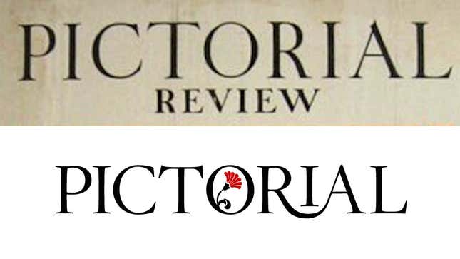
When we were brainstorming ideas for what to call this “subkinja,” a lot of names came up, but Kelly and I were pretty sure we wanted it to be something connected to old magazines. Not because that’s the only kind of content that will live here, but because that’s where so much good old stuff lives, and what spurred our love of media initially. It felt natural (to us) to name what we first referred to as yeoldeshit.jezebel.com after one of these publications. But which one?
A small selection of the names and words we dabbled with:
- Quarterly
- The Modern Priscilla
- Godey’s Ladies Book
- Illustrated
- Digest
- Companion
- Socialite
- Quality (the name of the magazine in Funny Face)
- Boudoir (the name of the magazine in Freaks and Geeks)
- Cat’s Meow
- Modern Bitch
That last one was sort of a joke, but only sort of.
Pictorial is the one we kept coming back to, because it seemed to indicate an old-timeyness, as well as emphasize how visual we’d like this space to be. It was inspired by the great illustrated publications of the Victorian age as well as The Pictorial Review, which was founded in 1899 in the way magazines of that time often were: as a way, in part, for a dress pattern maker to show off his wares. But like most women’s magazines of yore, it had a storied and complicated history; though it eventually absorbed into another fashion publication, The Delineator, in 1937, the Pictorial Review was for a time one of the most read women’s magazines in the country.
As a text interesting only to a select few of us—Women’s Periodicals in the United States: Magazines—explains, the magazine might have started off publishing a great deal of advertorial content, but when the former editor of the Woman’s Home Companion, Arthur T. Vance came on in 1907, things changed:
Vance brought controversial new writers to the magazine. Reformer Charlotte Perkins Gilman wrote about divorce; an unidentified woman wrote about leaving her husband; and muckraking journalist Rheta Childe Door explained why women wanted to be self-sufficient. During the mukraking period (1902-1912), the magazine conducted a number of investigations, the most notable of which looked into the general welfare of children.
Given Vance’s commitment to social change, as evidenced by the editorial content of the Pictorial Review, it came as no surprise when the magazine editorially supported suffrage, one of the few mass circulation women’s magazines to do so. As Vance wrote, “The Editor of the PICTORIAL REVIEW believes in Equal Suffrage.” Women, who were responsible for home care and child rearing, “might just as well be entrusted with National Housekeeping and National Housecleaning.”
Vance reportedly also said:
We appeal to women who want to think and to act as well as to be entertained. It is a feminine age. Women are taking more and more part in affairs and our idea is this: that a magazine correctly to represent the women of this country must keep its readers in close touch with questions of public interest, and guide and direct this feminine activity in the most useful and practical channels.
Seems like a natural history for the new Pictorial to come from.
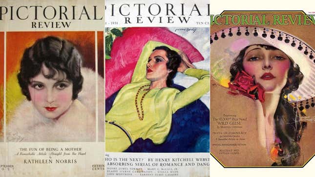
As for the logo, here are some old The Pictorial Review covers:
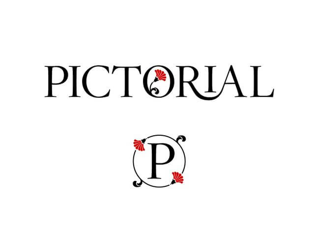
When we brought the name and some old covers like these to Jim Cooke, Gawker’s Art Director, he picked a new typeface with the 20s look in mind and modernized it a bit more, redrawing “the ‘RIA’ part to create a typographic ligature connecting the letters.” He also added a poppy to accent it, to make it “a little dangerous.”
There you have it. What’s old is new again, etc. etc.